Selected work / 2024
Kiwi.comFrom browsing to booking
Kiwi Deals sold cheap flights to people who had not chosen a destination yet — and then asked them to search for one. I added the step that gave them something to judge.
01Problem
Explorers with no destination hit a dead end.
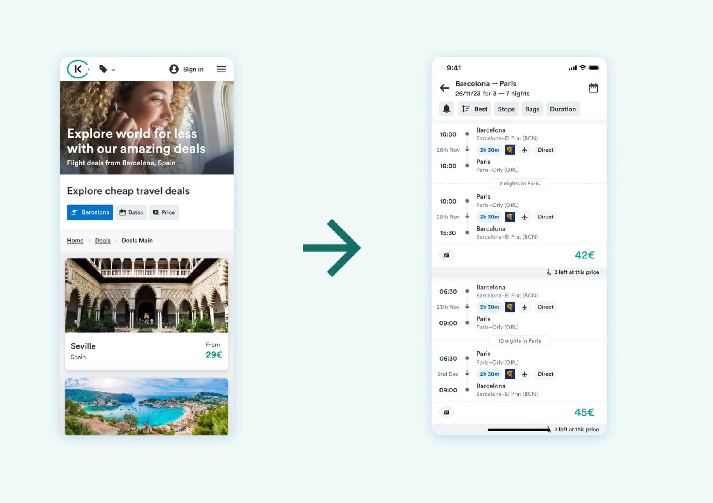
Kiwi Deals is the top of the funnel: it sells a price before it sells a place. People arrive on a cheap flight to somewhere they have not thought about, which is the whole appeal — and the page they land on answers only in prices and dates.
From there the only way forward was straight into search results: a list of itineraries to a city you knew nothing about. There was nothing to judge, no reason to prefer this place over the next deal, so a quarter of the people who got that far left instead of continuing. I was the designer on the customer acquisition team that owned this step.
02Research
People needed to judge a place, not just a price.
- With a price and two dates, there was nothing to weigh. Interviews kept returning to the same missing facts: what the weather will be like, what the place is known for, whether I am arriving in season.
- Not everyone wanted to explore. Some people had already found an option they liked and wanted to book it — for them, anything that looked like more browsing was in the way.
- Interest rose with reasons, not with discounts. A visible reason to choose a place moved people further than a lower number did.
- The technical discovery set the ceiling: whatever the preview showed had to come from data the product already had for every destination, live, with no editorial layer to write or maintain.
03The flow
The missing step, not the missing content.
The first instinct was to fit the missing information into the screens that already existed — a richer deal card, a denser results header. Every version of that ran out of room long before it had said enough for anyone to actually judge a place, and each one put a screen that was already working at risk.
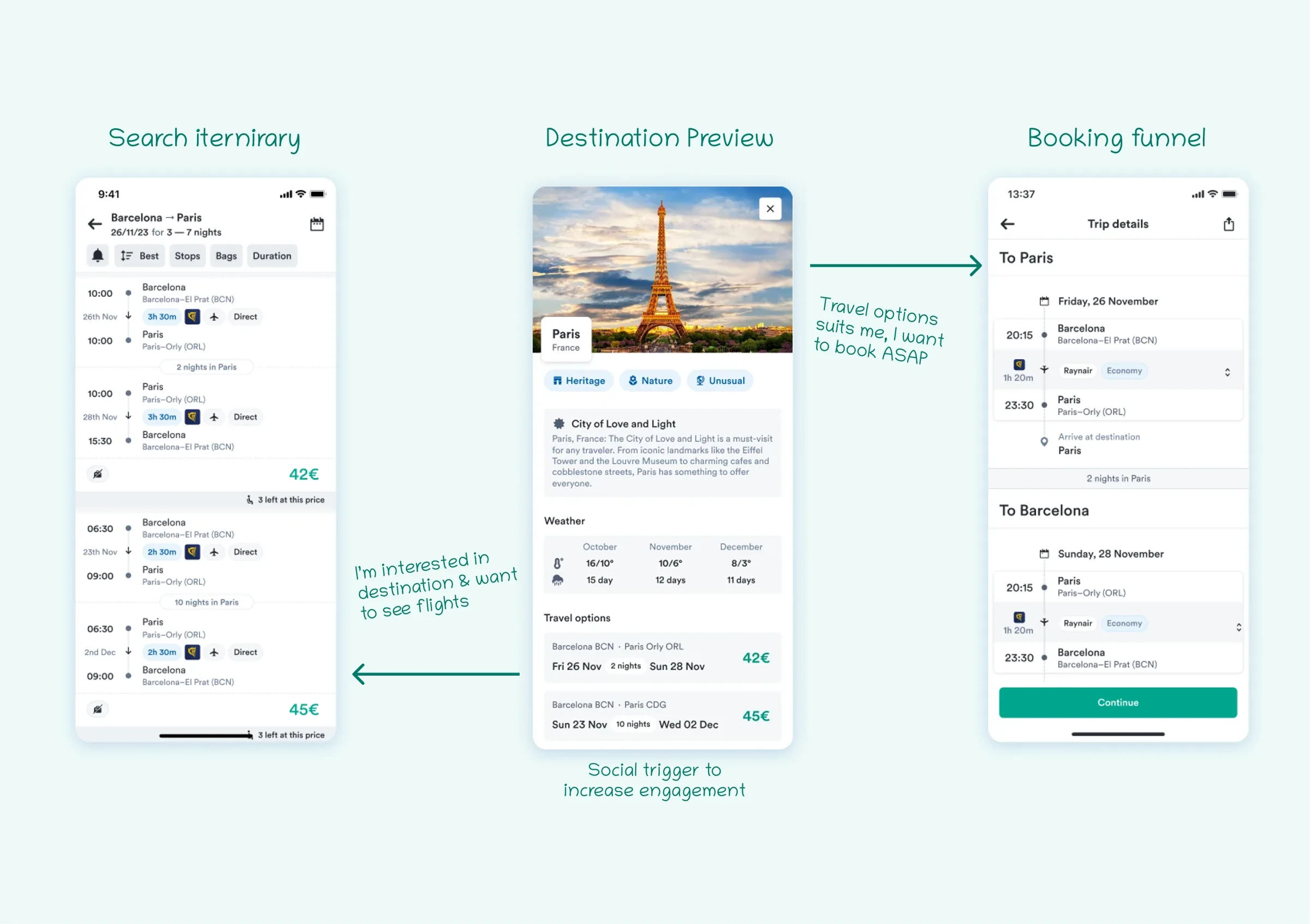
So the flow gained a step instead. Search itinerary → destination preview → booking funnel, with the preview carrying everything the deal card could not: what the place is, when to go, and what it actually costs on real dates. It also gave the flow two exits rather than one — keep exploring, or go straight to booking.
04Destination preview
A place you can judge in one screen.
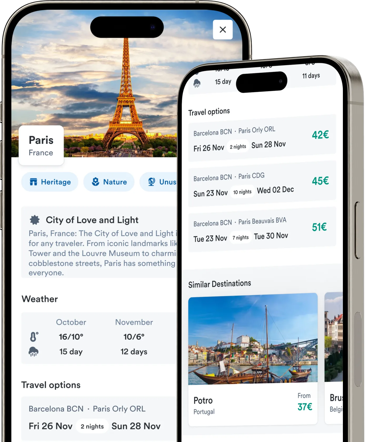
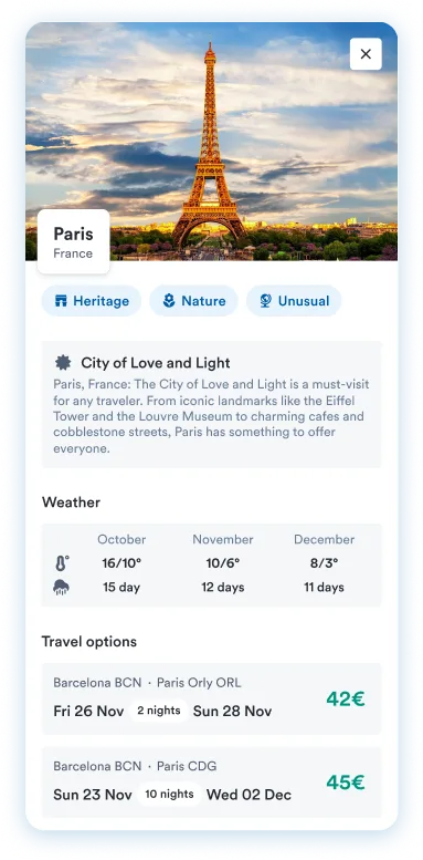
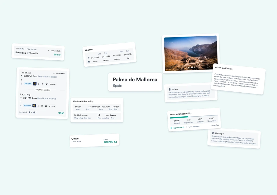
The preview answers the three questions the interviews kept surfacing, in that order. What is this place — a photograph, the name, and two or three tags that say what it is known for, with a short description under them. When should I go — temperature and rainy days by month, and a season band showing when demand is high and when it is low, so timing becomes a decision rather than a guess. What does it cost — real itineraries on real dates with their prices, not a “from” figure.
Every one of those came from live APIs the product already had. That was the constraint that shaped the components more than anything else: each block had to hold whatever the data returned for any destination in the catalogue — a long description or a thin one, four months of weather or twelve, Palma or Oman — without a human writing or checking anything.
Most of it was assembled from Orbit, Kiwi’s design system. The new components were the ones carrying information the system had never had to show: the month-by-month weather row, the high-demand season band, and the “known for” tags.
05The shortcut
A way out for people who were already sold.
The second finding would have been buried by the first. Adding a browsing step is exactly the wrong thing to do to someone who has already decided — so the preview had to be skippable from inside itself.
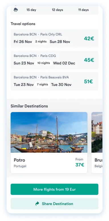
That is what the itinerary list does. Those are not examples: each one is a bookable option on specific dates, and tapping it goes straight into the booking funnel, past search results entirely. The same screen keeps a way back for everyone else — more flights from the lowest price for people who want to compare, similar destinations for people not sold on this one, and a share action, because a trip is usually decided with someone who is not holding the phone.
Key decision & trade-off
I added a step to the flow instead of removing one.
Rejected
Fitting the missing detail into the existing layout. It would have kept the flow one step shorter, but there was no room to show enough for anyone to actually judge a place, and it put the screens that already worked at risk.
Accepted trade-off
The extra step costs a click, and click-through to search results went down rather than up. I took that trade because the people who go through the preview arrive already knowing where they want to go — and the metric that pays for the page is bookings completed, not searches run.
06Outcome
+15%
Bookings started from the Kiwi Deals page
Unmoderated A/B test · 20 participants · 2024+3.2%
Bookings completed — the primary metric
Unmoderated A/B test · 20 participants · 20244.8/5
How well the information answered the question, and readiness to book
Rated by the same participants, on the new flowThese come from unmoderated testing against the current flow, in two groups of ten split between Europe and America — not from production analytics. The same test showed a modest drop in click-through to search results, which is the cost the preview was always going to carry. The design met the requirements and shipped to the whole Kiwi Deals flow in spring 2024.
07Reflection
What it taught me
Adding a step to a flow does not automatically add friction. Sometimes it is the only way to make the flow work at all — and the way to pay for it is to let the people who do not need it skip past it, which is what the itinerary shortcut was for.
The honest limit of the evidence is that the numbers are from a twenty-person test, not from production, and that one of them moved the wrong way. The case rests on completed bookings rather than a clean sweep. The design ran in production from spring 2024 until the summer of 2026, when this part of the product was folded into Kiwi’s AI search — so the screens no longer exist, and the argument they were making has been handed to a different mechanism. What I would keep from it is the question, not the layout: what does someone need to know before the choice you are asking them to make is a real choice?