Selected work / 2026
EnergymThree apps, two business models, one product.
A gym chain moving upmarket had three old apps and a second brand about to launch. The answer was not a fourth app.
01Problem
Three apps, none of them enough.
Energym runs three clubs in Ukraine — Silver Breeze the flagship — with a fourth under construction, and is moving from mass market into the semi-premium bracket. It arrived with three separate apps: different vintages, different visual languages, and between them still short of what the business needed to run — schedules, class booking, balances, what a card actually entitles you to.
At the same time the chain was launching EG Studio, a second format where you do not buy an expensive club card but pay a membership for studio access only. Two audiences, two price points, one brand.
Rebuilding on top of any of the three was not worth the cost. The brief was a single app that carries both models, automates what the front desk had been doing by hand, and gives members a reason to come back more often. Requirements came from the brief and from interviews with the product team and stakeholders.
02Schedule
A schedule you scan, not one you read.
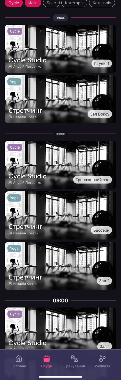
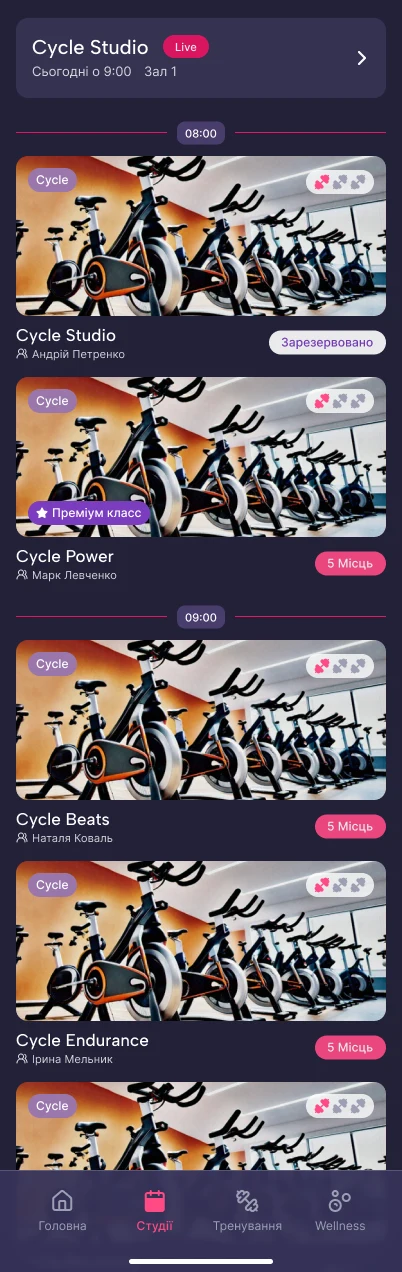
The first direction drew the schedule as full-width photo cards, one image per class down the day. It was dropped for three reasons, in this order: the chain has no usable photography per class and no way to produce it; the timetable changes too fast for anyone to keep images attached to the right class; and a photo the height of a thumb turns “what is on at nine” into a scroll.
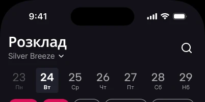
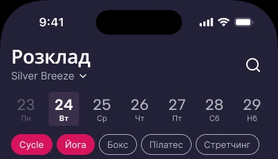
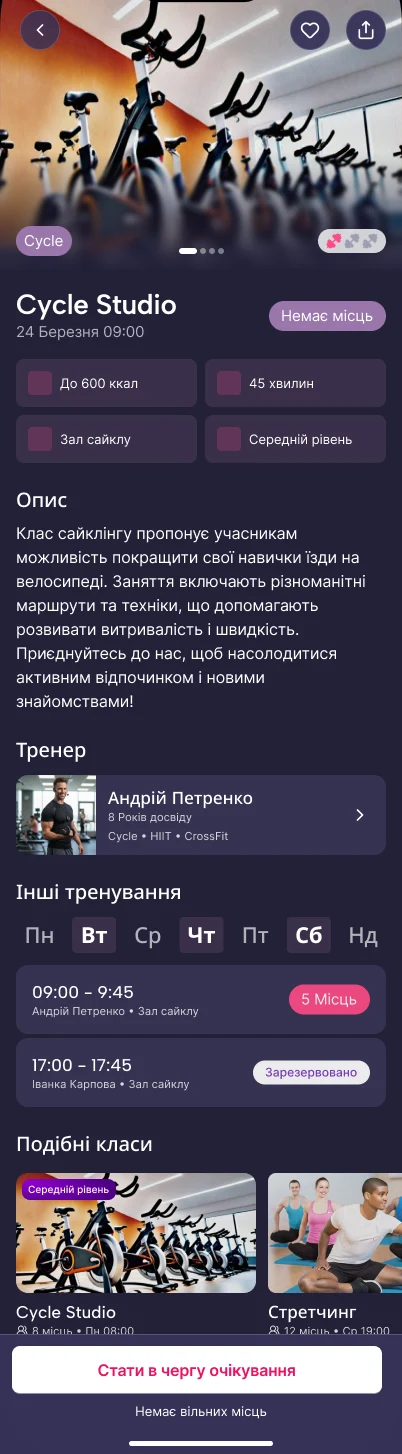
The shipped schedule is dense on purpose. A day strip, filters held open rather than hidden behind a search field — that came out of the client review, along with folding the separate classes screen into the schedule itself — and a row per class carrying the four things that decide it: time, name, trainer, room.
The class page then answers what the row cannot: what the class is, who runs it, what it costs you in effort and in money. Two of its parts changed in review. “What to bring” became one checklist shared by every class of the same type instead of free text per class, and “what to expect” dropped its formatting for plain prose.

03Booking
The full class that is never actually full.
Popular classes fill within minutes. They also empty again: people cancel late, get refunded, and the class runs underfilled while the members who wanted it were told no, hours earlier.
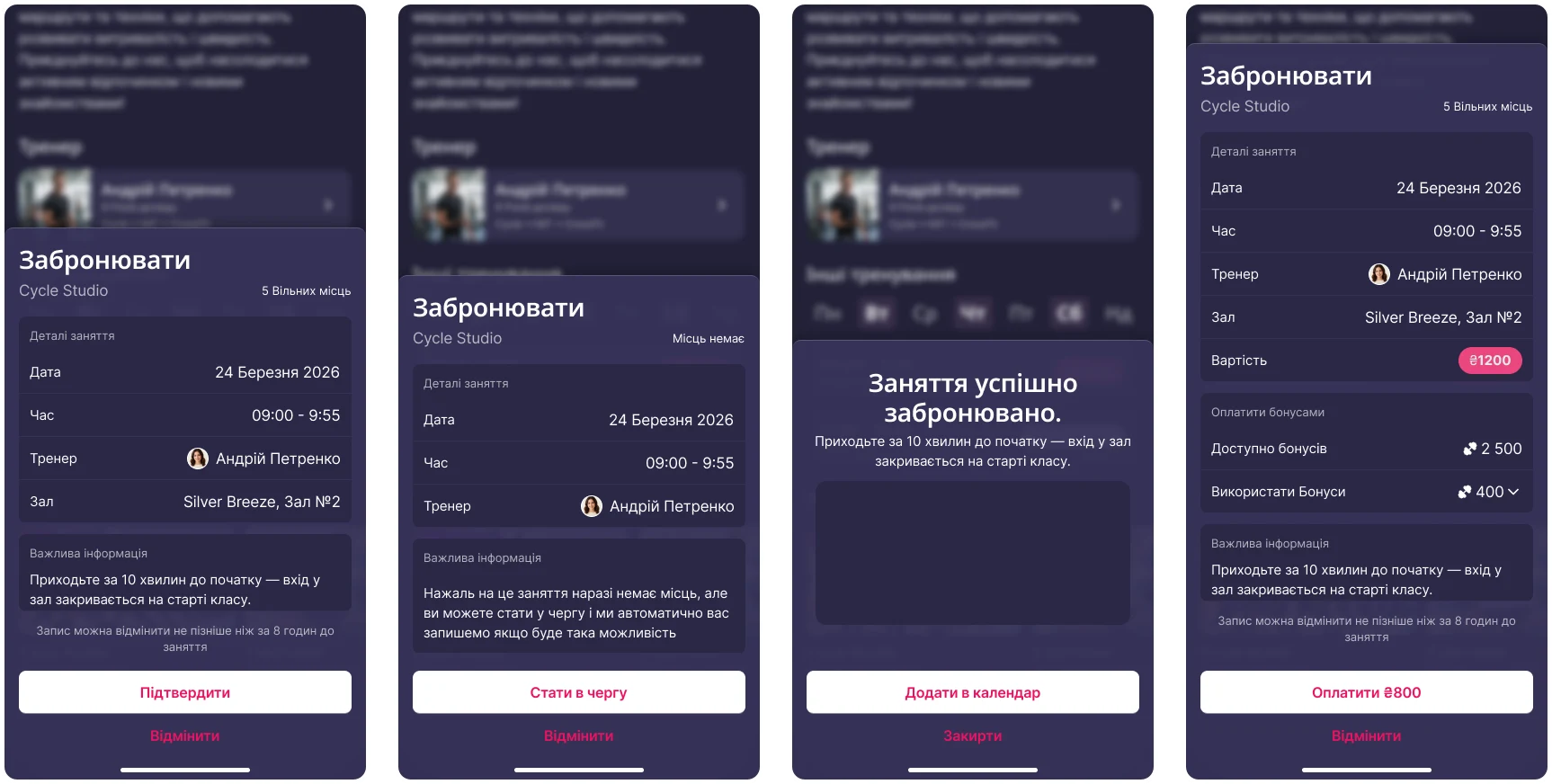
So booking has a waitlist. You join the class and the time you actually wanted without a guaranteed place, and you learn where you stand a couple of hours before it starts. Cancellation is capped at eight hours out, which is what makes the released seats worth queueing for.
The sheet itself lost steps in review: seat selection and tipping came out entirely, and the time you picked is shown back to you rather than asked for again. What stayed is the confirmation, the calendar hand-off, and — for paid classes — bonuses.
Members earn Encoins and can put them against a paid booking instead of holding them as an abstract balance. The point is the first personal session: a paid class you have never tried is an expensive guess, and a partly covered one is a cheap one. Bonuses existed nowhere in the three old apps.
04Gamification
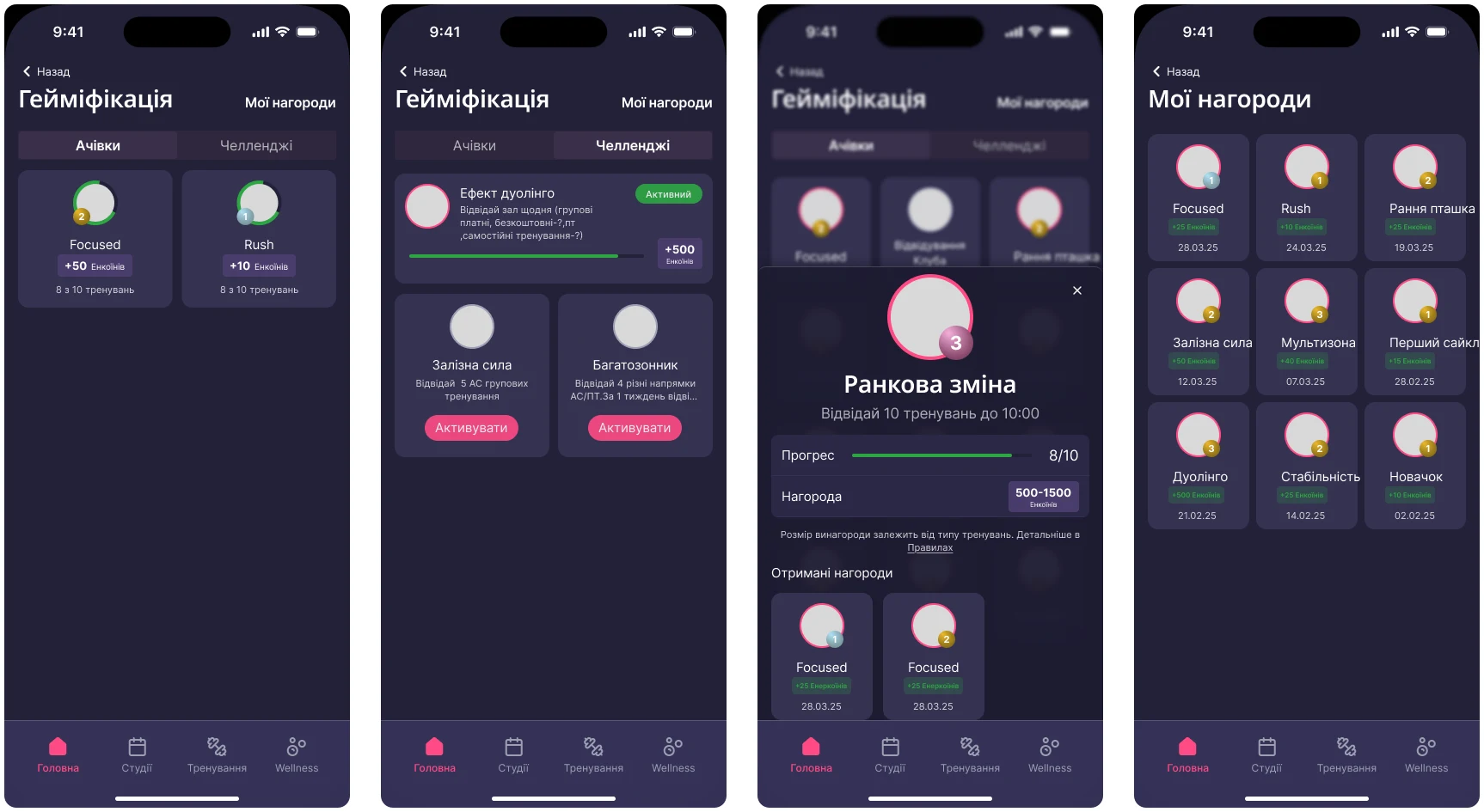
Attendance is the metric. Achievements are the lever.
Gamification arrived as a client requirement, and the thing it had to move was regularity of visits. The reference is not hidden: Monobank has trained a whole country to collect achievements, and the pattern works because it gives people something to compare.
Achievements are the standing set. Challenges are a second layer — the same mechanic bounded by a window and worth more points, so there is a reason to act this month rather than eventually. Points become Encoins, and Encoins come back as discounts and part-payments, which is what keeps the loop attached to the business rather than to a shelf of badges.
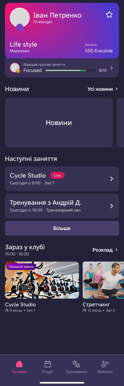
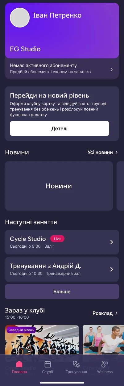
The home screen leads with the membership card and the progress on it, then the next class, then what is running in the club right now. News moved up in review and kept one item with a larger banner.
05Membership
Everything the front desk used to answer.
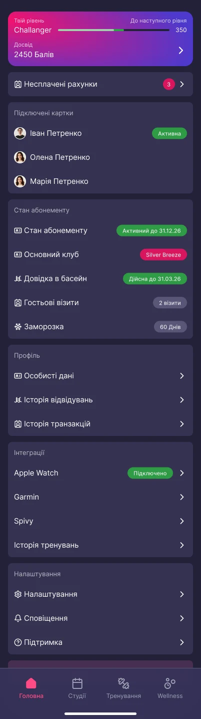
The profile is where the automation actually lands. Membership status and expiry, which club is home, the pool certificate and its date, guest visits remaining, freeze days left, linked cards for family members, unpaid invoices with a count on them — every one of those a question that previously required a person at a counter.
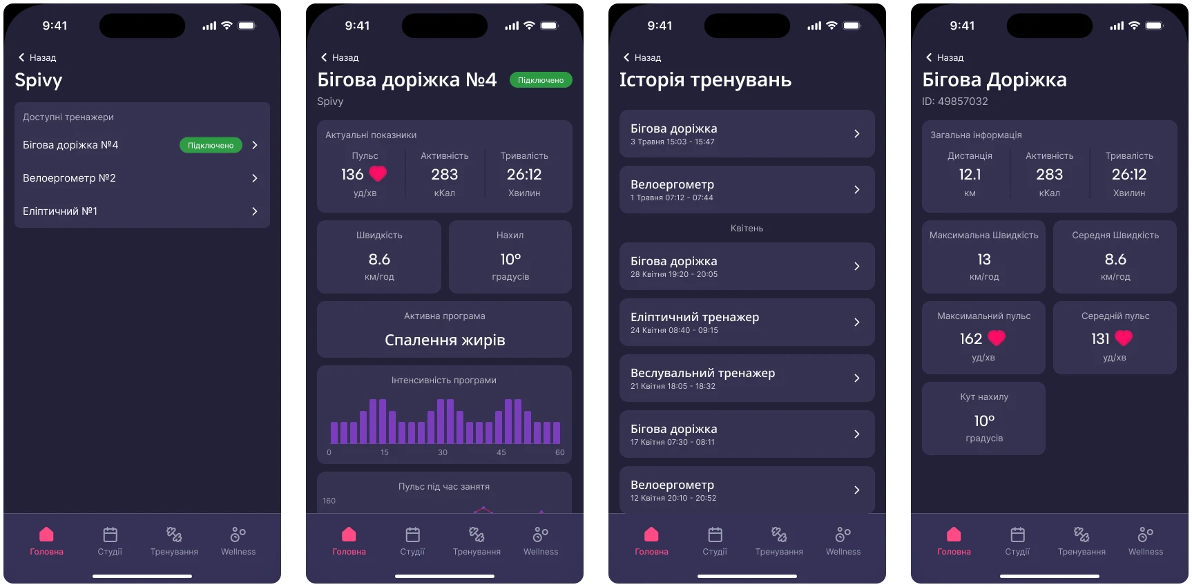
Below that sit the integrations. Apple Watch and Garmin are the expected ones. Spivy is not: the cardio machines on the floor are connected, so a treadmill session lands in the app by itself, with pace, heart rate, incline and the session broken down. No phone in hand, no manual entry.
Personal data is deliberately read-only, on the client’s instruction.
06EG Studio
The second model, in the same shell.
EG Studio members do not get the gym floor. They pay a membership and book studio sessions — a different promise at a different price. The chain had made that split before design started; the work was deciding what it means screen by screen.
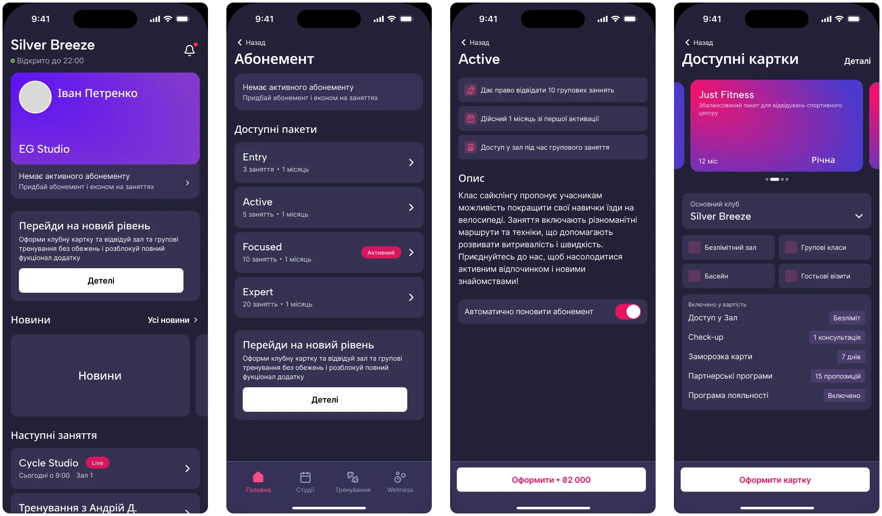
Where a club member carries a card, a studio member carries a package — Entry, Active, Focused, Expert — with the level, the sessions left and the renewal in the place the card would have been. Everything above it is the same product: same navigation, same components, same schedule.
And every one of those screens holds a standing path up into the full club card, because selling that upgrade is what the format is for.
Key decision
One app that becomes a different product at login.
The alternative
Two apps, one per model — roughly what the three legacy apps had already done, and the easier thing to build. Each could then be tuned to its own audience without holding anything in common.
Why it branches instead
EG Studio exists to sell a way up into the full club card, and an upgrade that crosses an App Store boundary is an upgrade that does not happen. So the split lives inside the product: one navigation, one component set, one design system, with the account deciding which content and which commercial model opens behind them.
07Expected impact
Consolidation
Three apps → one
A single product carrying both commercial models, replacing three inconsistent legacy apps.
Ships to the Ukrainian App Store in October 2026.Automation
Off the front desk
Schedule, booking, balance, membership state and entitlements answered in the app rather than at a counter.
Expected, not measured — measurement starts at release.Retention
A reason to return
Achievements, challenges and Encoins aimed at visit regularity, with bonuses lowering the price of a first paid session.
Expected, not measured — measurement starts at release.08Reflection
What it taught me
Version one carries a lot: two commercial models, gamification, connected machines, wellness, partners, invoices. Holding that together meant deciding, screen by screen, which parts of a shared shell were allowed to diverge and which had to stay identical. That was the discipline the project actually turned on, and the part that took the two months.
The other lesson came from the client reviews. Almost everything that came back was a request to take something out: a search field above filters that were already open, a step asking for a time that had just been chosen, a rating on a trainer nobody was shopping for. Sitting in a room while someone deletes your work in real time is the fastest edit there is.