Selected work / 2026
MomenticketA booking path that wasn’t converting.
It began as a design audit of conversion. It became a rebuild of three parts of the booking path — search, route card, booking.
01Problem
Built for desktop, used on phones.
Momenticket sells cross-border coach tickets out of Ukraine. Almost nine in ten people arriving are on a phone — and the booking path they meet was laid out for a desktop screen.
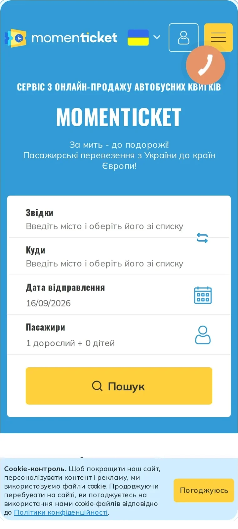
That mismatch showed up as friction at every step rather than one dramatic failure. The search field refused to autocomplete. Results published everything the system knew, in no particular order. Payment happened inside the route card, which rearranged itself as you typed, and ended in a mandatory sign-up behind a modal with no way out.
A design audit was commissioned to find which of those steps was actually costing bookings, and in what order to fix them.
02Design audit
Five methods, one consistent story.
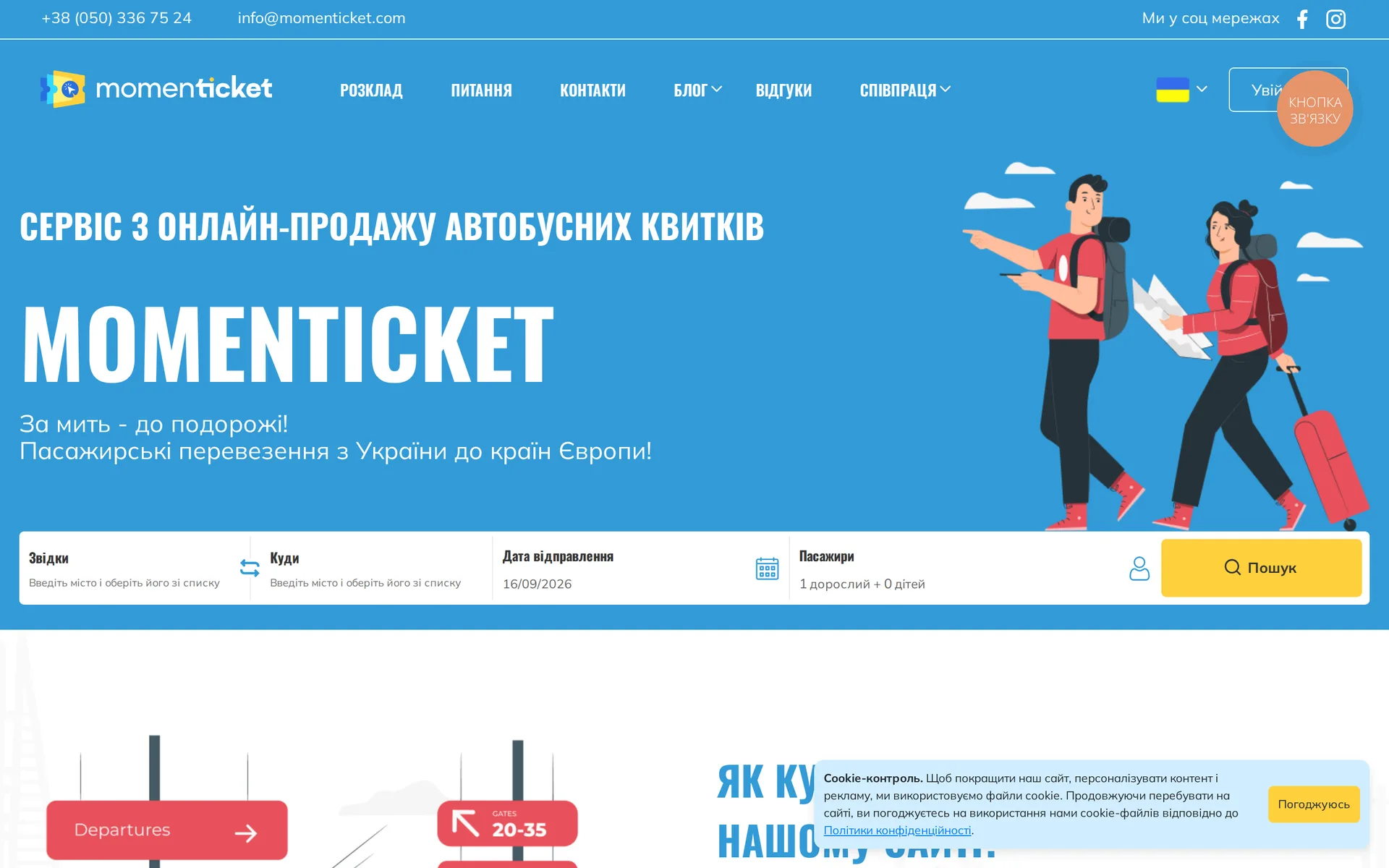
- The first thing people touched was not the search form. The cookie banner and its accept button took roughly 14% of every tap on the homepage.
- 2,202 clicks landed on the hero title and subtitle — text that does nothing. People were hunting for something pressable.
- 78% never scrolled past the search form. Everything below it was, in practice, invisible.
- Registration was mandatory and only announced at the end, inside a modal with no close button — the single clearest place where a ready buyer could be lost.
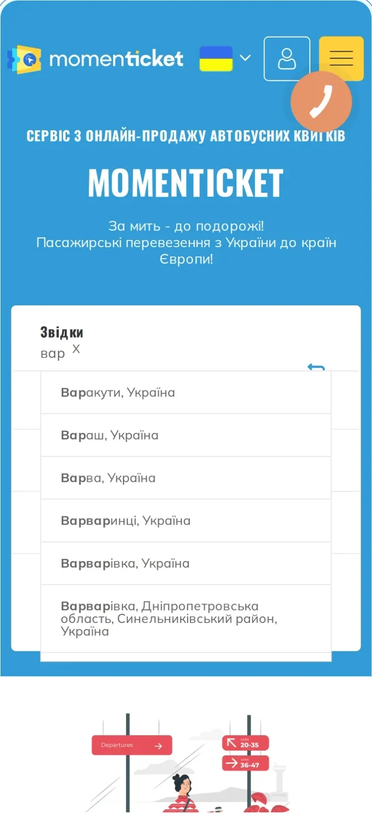
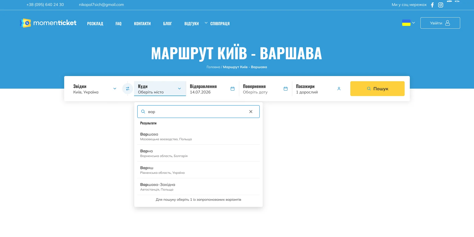
- City suggestions are ordered alphabetically rather than by demand, so the busiest destination on a route sits below five villages that share its first letters.
autocomplete="off"on the same fields, and again on the passenger form, removes the browser’s fallback — on a site where 87% of users type on a phone.
03Search
Make the first field answer back.
A suggestion list does appear — it is simply ranked alphabetically. On the Kyiv–Warsaw route, typing “вар” returns Варакути, Вараш, Варва, Варваринці and Варварівка — five villages, with Warsaw below the fold. autocomplete="off" on the same field then suppresses the browser’s own saved entries, so a returning traveller gets no help either.
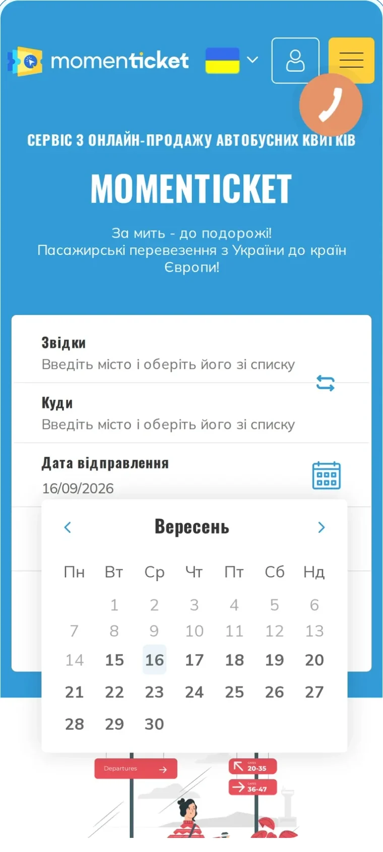
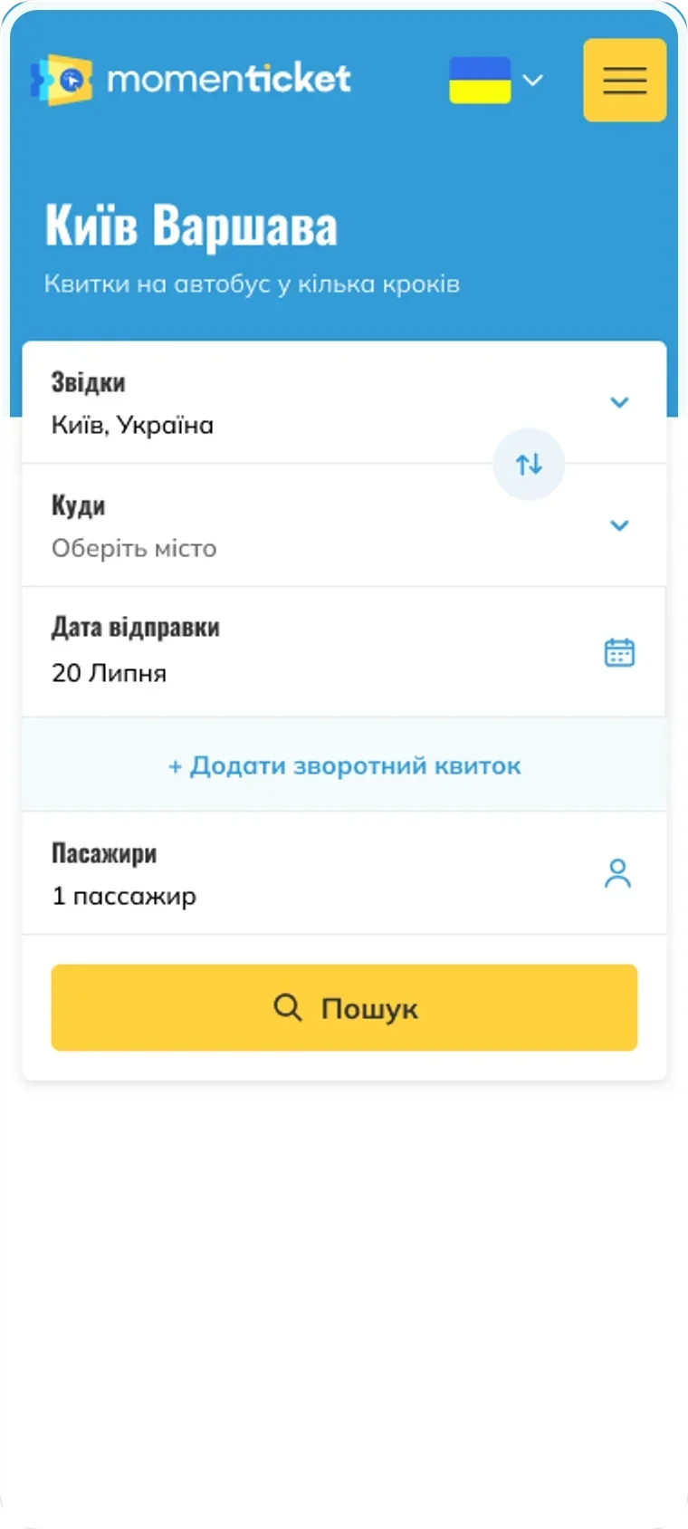
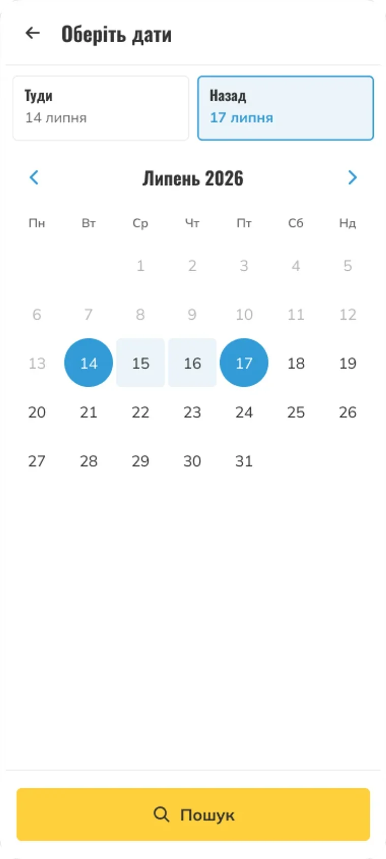
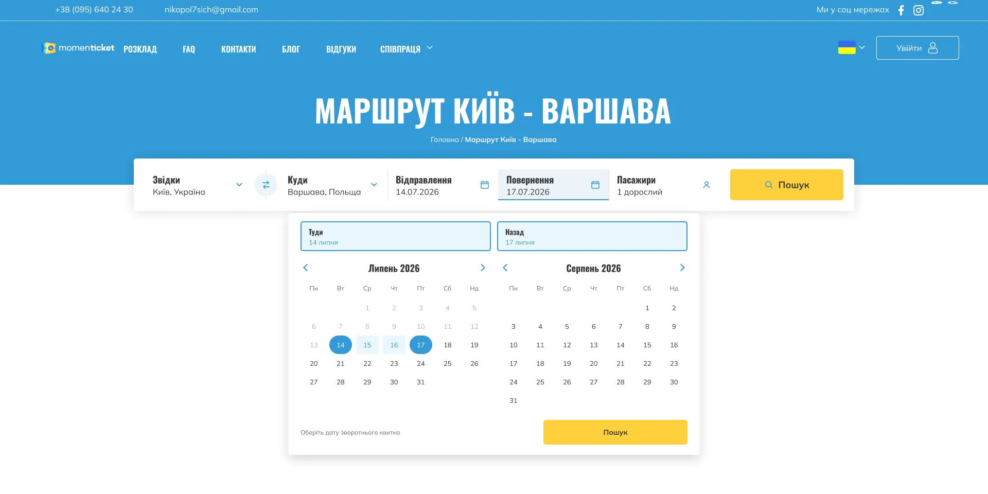
So the field had to answer back. Autocomplete now groups results and leads with popular destinations and the traveller’s own recent searches, so the common case is a tap rather than a spelling test. The date picker handles one-way and return in the same control. On mobile every field opens full-screen — the keyboard no longer fights the form for space.



04Route card
Everything the system knew, all at once.
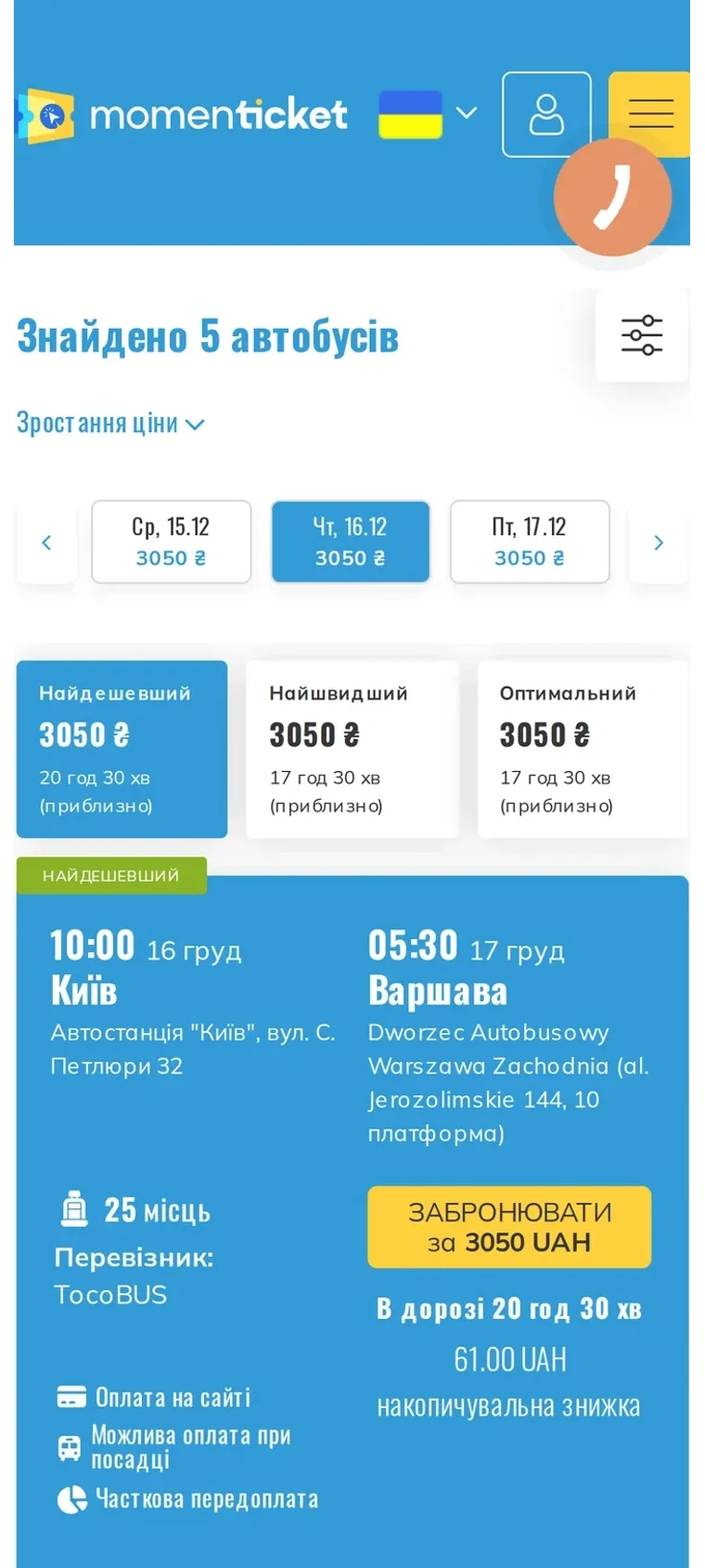
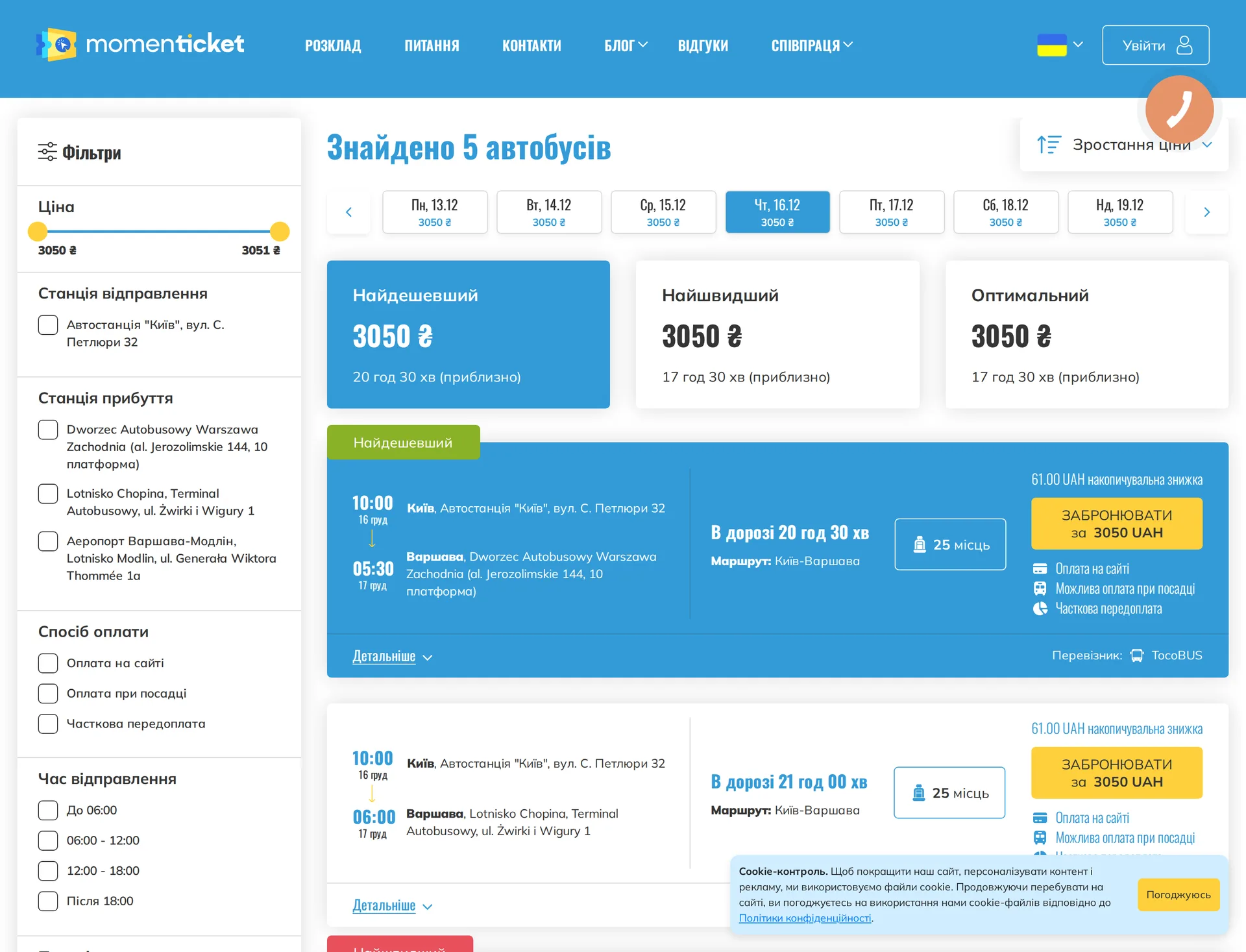
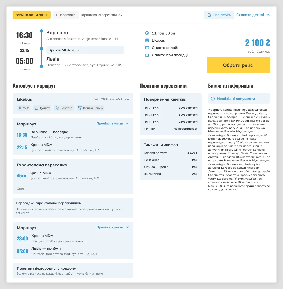
The old card published every fact the system held: three payment badges, a cumulative discount line, amenity icons, the carrier, the full station address at both ends. Filters took a third of the screen. Nothing was ranked, so nothing stood out — and comparing two departures meant reading two dense blocks line by line.
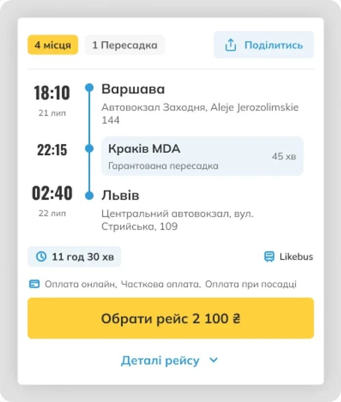
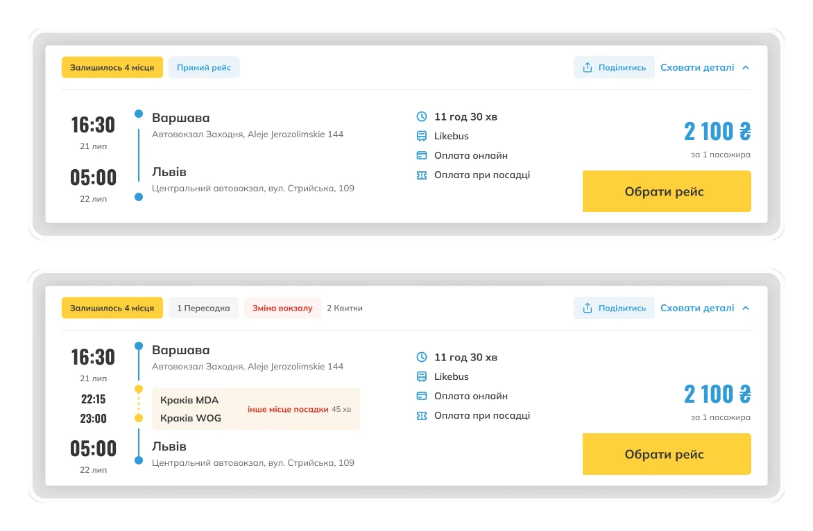
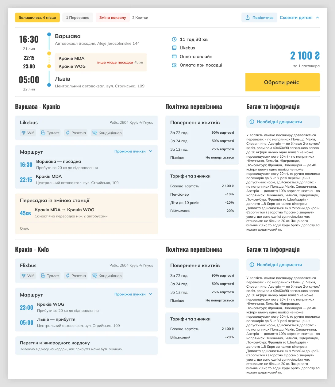
The rebuilt card carries only what decides a trip: times, duration, transfers, price. Everything else moved behind an expand, one tap away and complete when you want it. Transfers became explicit rather than a footnote — direct, guaranteed connection, change of station, self-transfer each read differently at a glance, because that difference is what a traveller is actually buying.


05Booking
Where a ready buyer was still lost.
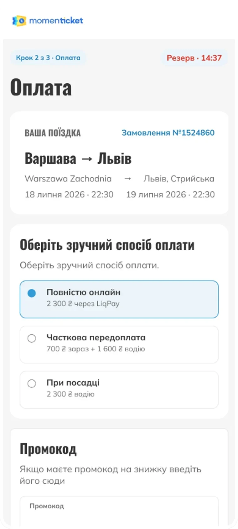
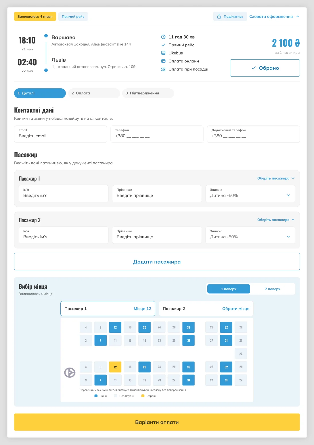
Checkout happened inside the route card. The card rebuilt itself as you filled it in, buttons moved out from under you, and there was no indication of how many steps remained. Registration was mandatory and arrived as a surprise at the end, in a modal with no close button and no way back.
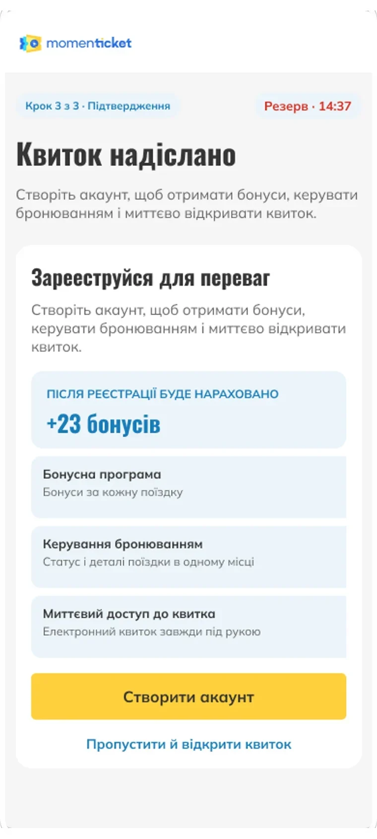
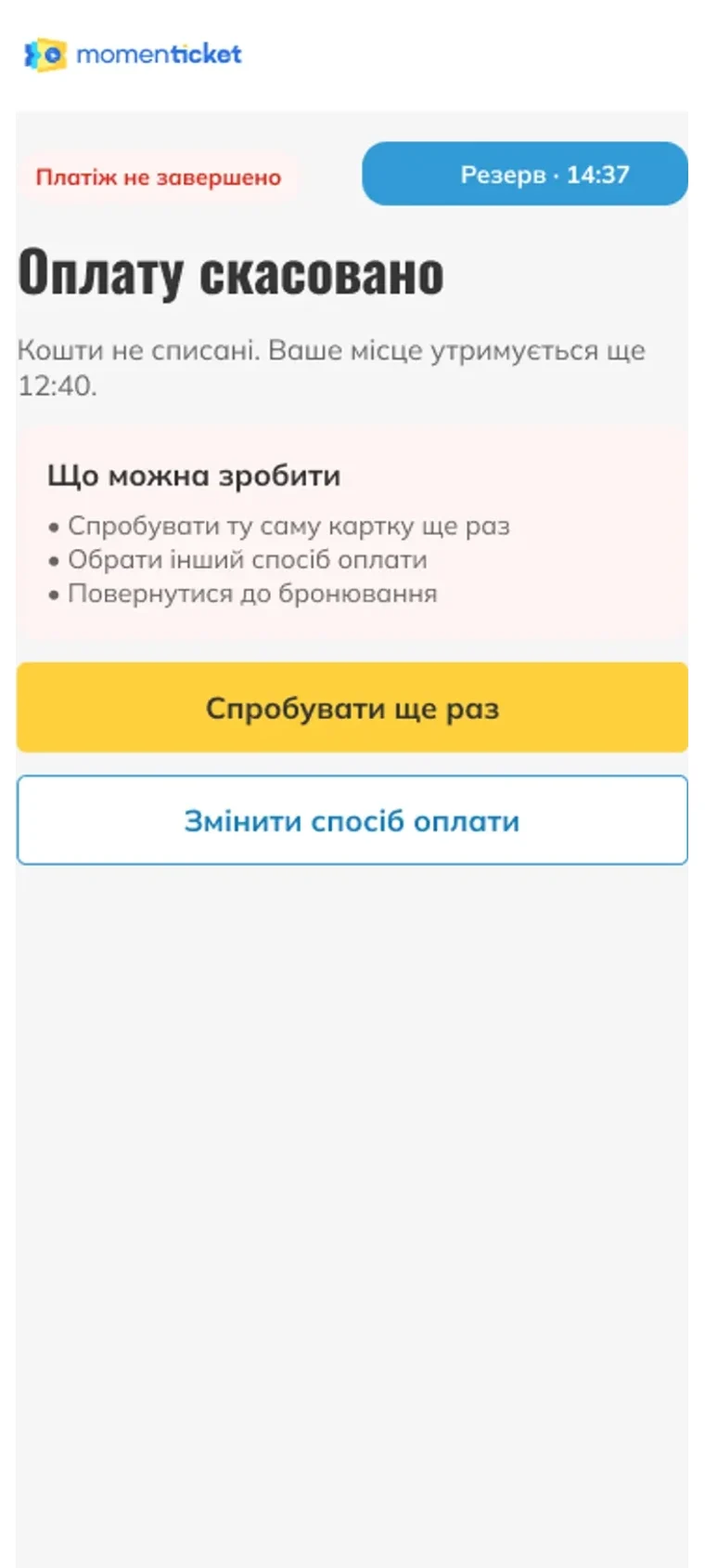
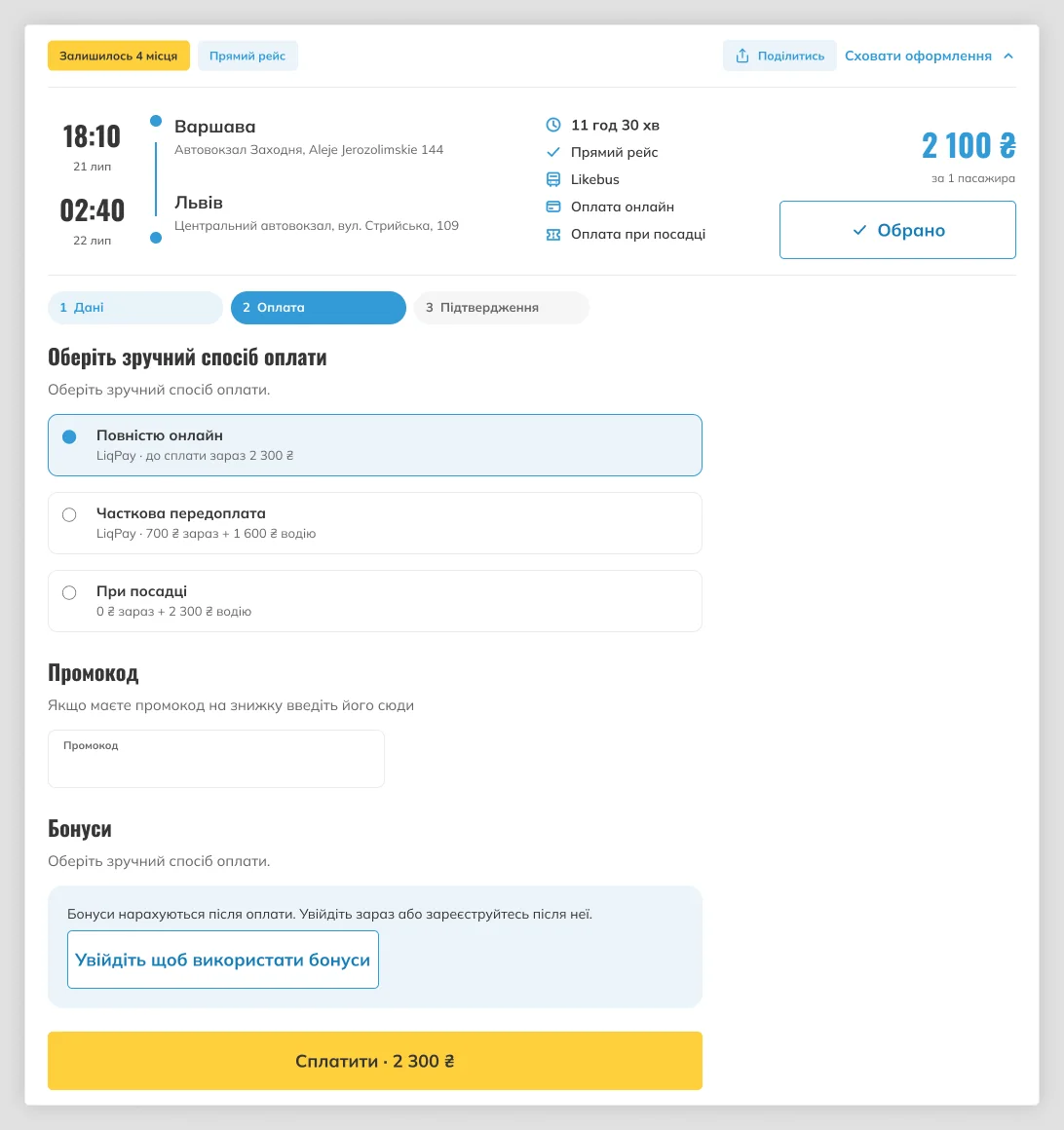
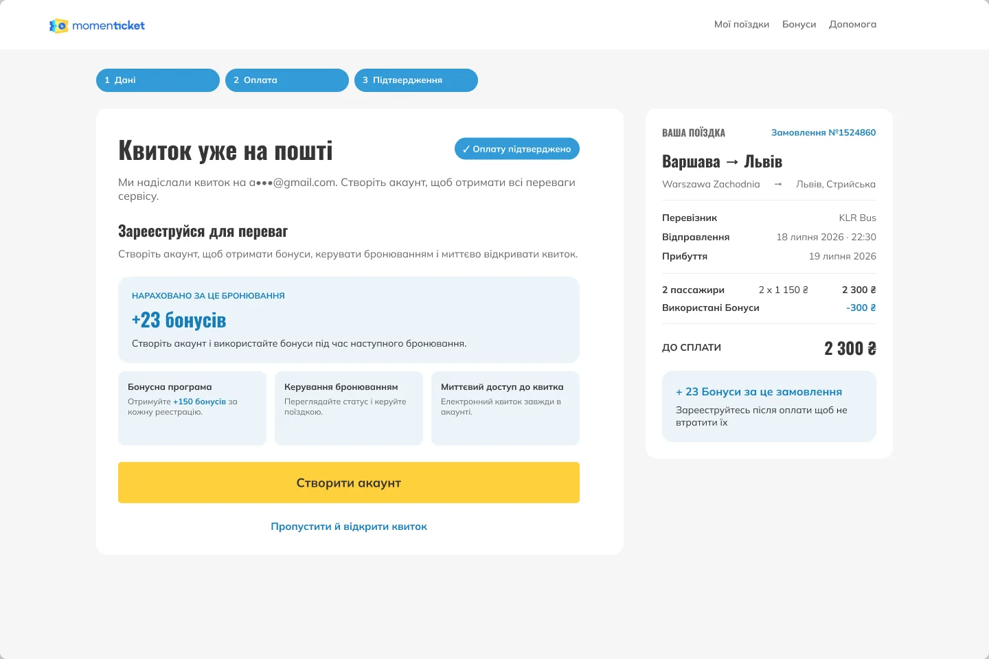
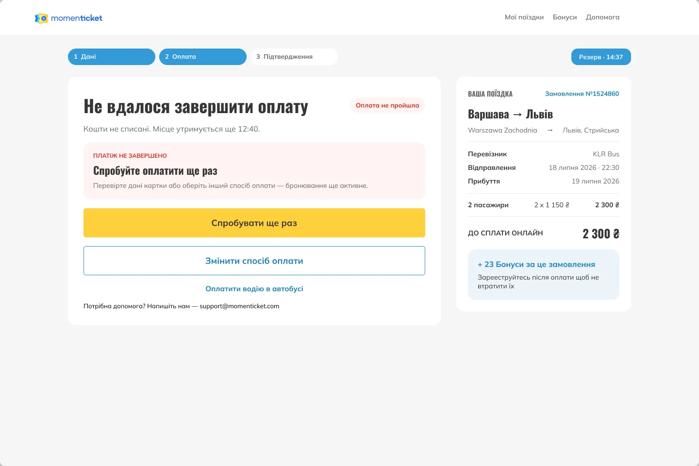
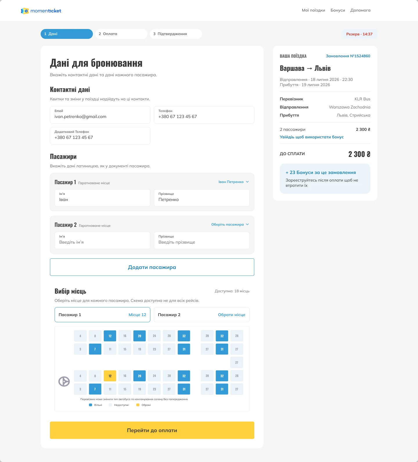
Booking is now three declared steps — details, payment, confirmation — with the stepper visible throughout and the price held in view. Registration became optional: you buy as a guest and are offered an account afterwards, which is what both Omio and Tickets.ua already do. Every ending resolves to a next action, including the ones nobody designs for: verification pending, payment failed, paid on the bus.

Key decision & trade-off
A separate checkout was the right answer. The engine could not host it.
Designed, then deferred
The flow was first drawn as a standalone checkout on its own route, the pattern the audit pointed to and the one both benchmarked competitors use. The current site engine cannot serve it.
Accepted trade-off
So the same three steps ship inside the route card, which the engine can render today. It costs the clean URL and some room to breathe. I took it because a staged checkout that exists now beats a better one that waits — and the structure ports to the new engine, where the separate flow can also carry insurance, food vouchers and other extras a card has no space for.
06Route pages
A page per route, answering the route’s questions.
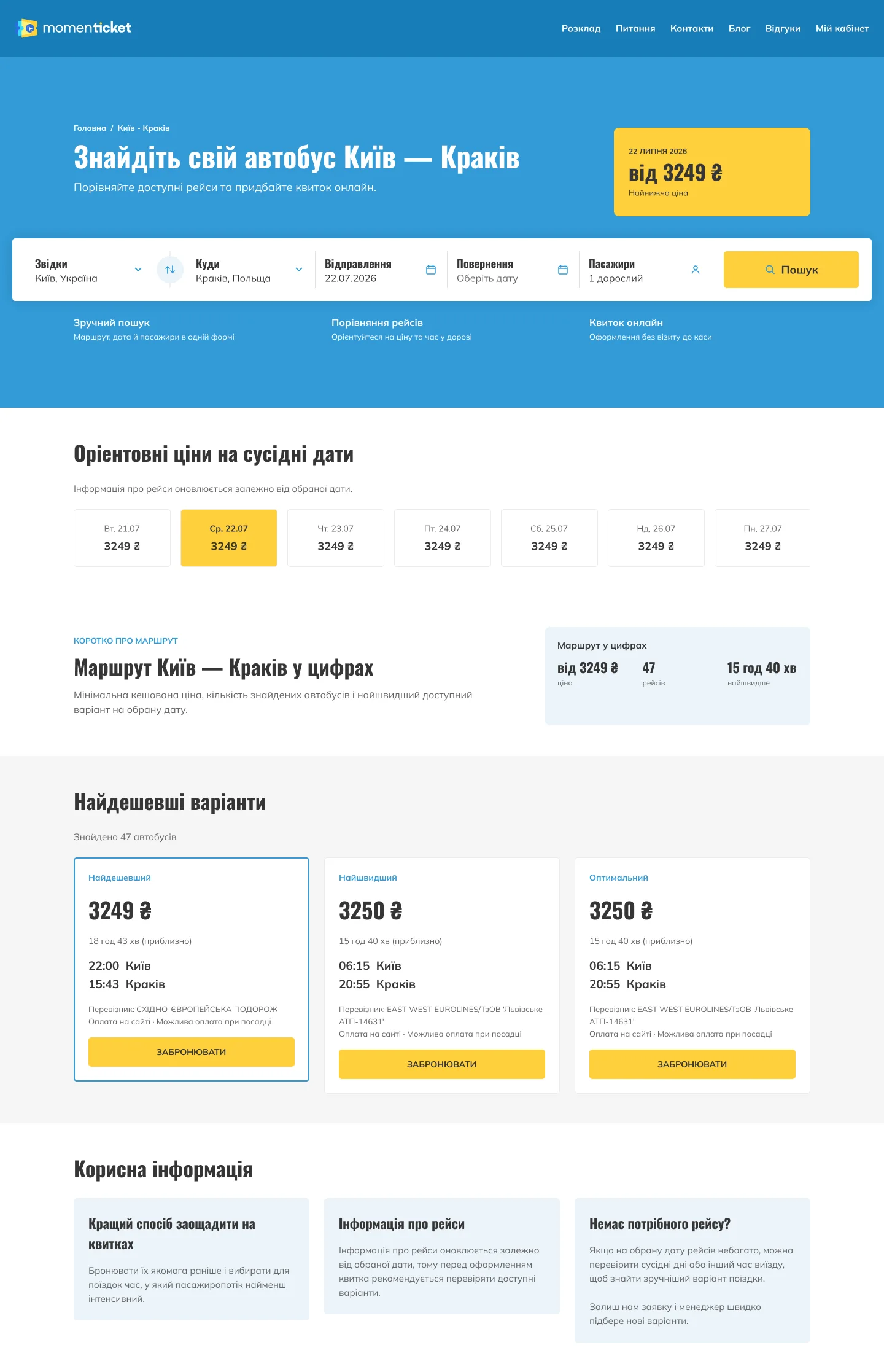
A separate, smaller piece of work: a landing page built from scratch for a single origin–destination pair — Kyiv–Kharkiv, Kharkiv–Lviv, Kyiv–Warsaw and so on — in both desktop and mobile layouts.
Someone who arrives here has already named their route, so the page answers for that route before the form is touched: the lowest cached price with its date, prices on the neighbouring dates, and the route in numbers — from-price, how many buses run it, the fastest time. Three departures are picked out and bookable — cheapest, fastest, and the balance between them — so a decided traveller never has to run a search at all. The search form is there, pre-filled with the route, for everyone else.
The rest of the page exists for the answer being no: related routes out of both cities, the advice that shifts a trip by a day or an hour, and a request form when nothing on the page fits.

07Expected impact
Conversion
Fewer drop-offs
Guest checkout, working autocomplete and a declared three-step flow each remove a documented reason to abandon a booking.
Expected, not measured — the rebuild is in development.Defects
38 violations
Heuristic violations logged by the audit, six of them critical. The rebuild closes the interface half; load time and ad targeting sit with the team.
Six critical, sixteen major.Checkout
A shorter purchase
Payment runs as three visible steps with the price in view, instead of a card that rearranges itself and a sign-up nobody expected.
Expected, not measured — the rebuild is in development.08Reflection
What it taught me
Almost nothing here is invention. Autocomplete, guest checkout, a visible stepper — Omio and Tickets.ua have shipped all of it for years. The work was diagnosis and sequencing: establishing which broken step was worth fixing first, then fixing those in an order the current engine could actually carry. The honest limit is that none of it is measured yet — and that the analytics we started from turned out to be unreliable, which is its own lesson about trusting a funnel before you trust its instrumentation.